Choose Beautiful Living Room Color Combinations for Kenyan Homes in 2026
The Rule That Makes Every Palette Work
Interior designers use the 60-30-10 rule to balance any room. Before choosing your colours, assign them roles — not just names. Your dominant colour lives on your walls and large sofa. Your secondary colour lands in rugs and curtains. Your accent colour lives in cushions, lamps, and décor.
When all three roles are filled, the room feels designed. When even one is missing, it feels unfinished — regardless of how nice the individual pieces are.
Combination 01
Beige + Warm White + Walnut Brown
Mood: Soft luxury & timeless elegance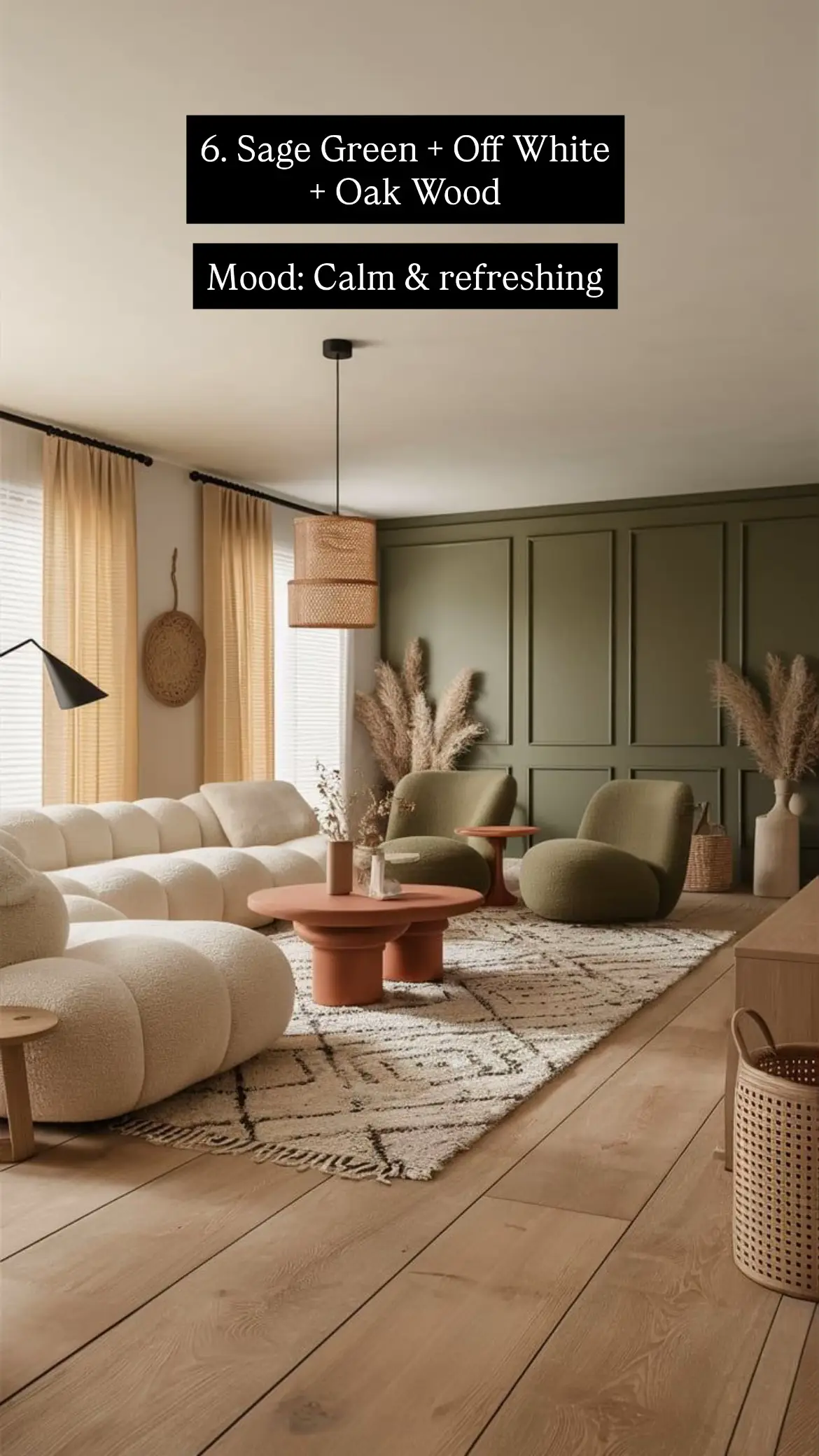
A curved beige sectional sofa, warm white panelled wall, and walnut wood coffee tables — the definition of effortless elegance.
This is the combination that never goes out of style — and in 2026 it is more popular than ever. The shift this year is away from cool, flat beige toward warm, sandy beige with honey or yellow undertones. The difference is subtle but transformative: warm beige glows in Kenya’s natural light; cool beige looks washed-out.
The formula: beige as your sofa and rug (the 60%), warm white on the walls (the 30%), and walnut brown in your wooden furniture — the coffee table, TV stand, and shelving (the 10% that anchors everything).
Best for: Open-plan maisonettes and villas, homes with white-panelled feature walls, families who want a look that won’t date in three years.
Combination 02
Olive Green + Cream + Black
Mood: Sophisticated & earthy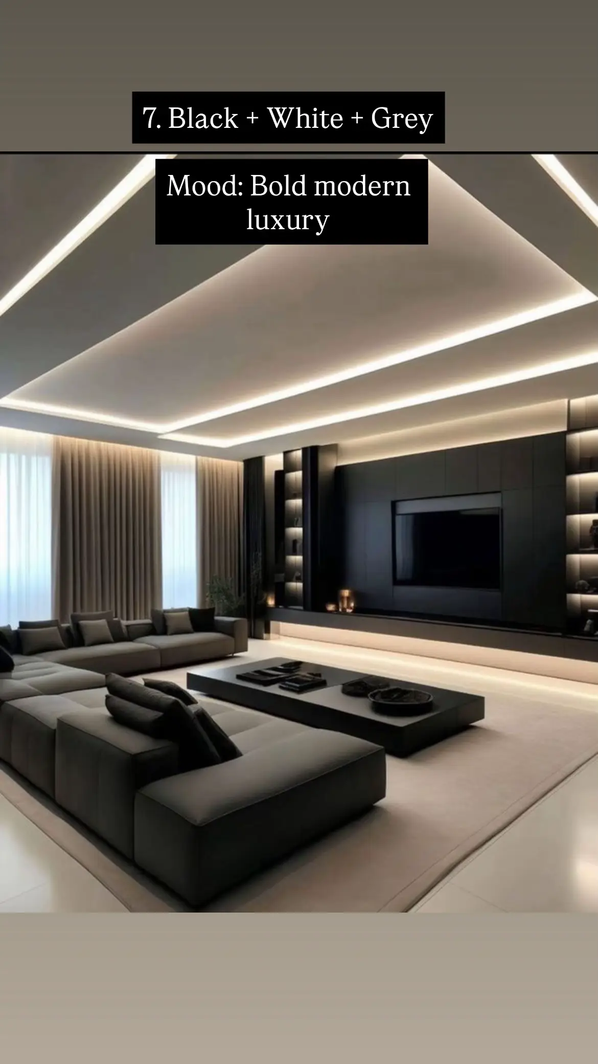
A cream bouclé curved sofa, black marble coffee table, and olive green accent chair — bold but perfectly balanced.
Olive green is the breakout colour of 2026. Designers call it “the grounding neutral that isn’t boring” — and this room shows exactly why. The cream sofa does the heavy lifting as the dominant piece, olive green adds character through the accent chair and cushions, and black in the coffee table and lamp delivers the edge that stops the palette feeling soft.
Notice the large-leaf tropical plants — they tie the olive green into the room naturally. This is an easy, low-cost addition that Kenyan homes do brilliantly given our climate.
Best for: Modern apartments in Upper Hill, Westlands, and Riverside — rooms where you want a sophisticated, gallery-like feel.
Combination 03
Grey + White + Natural Wood
Mood: Clean modern aesthetic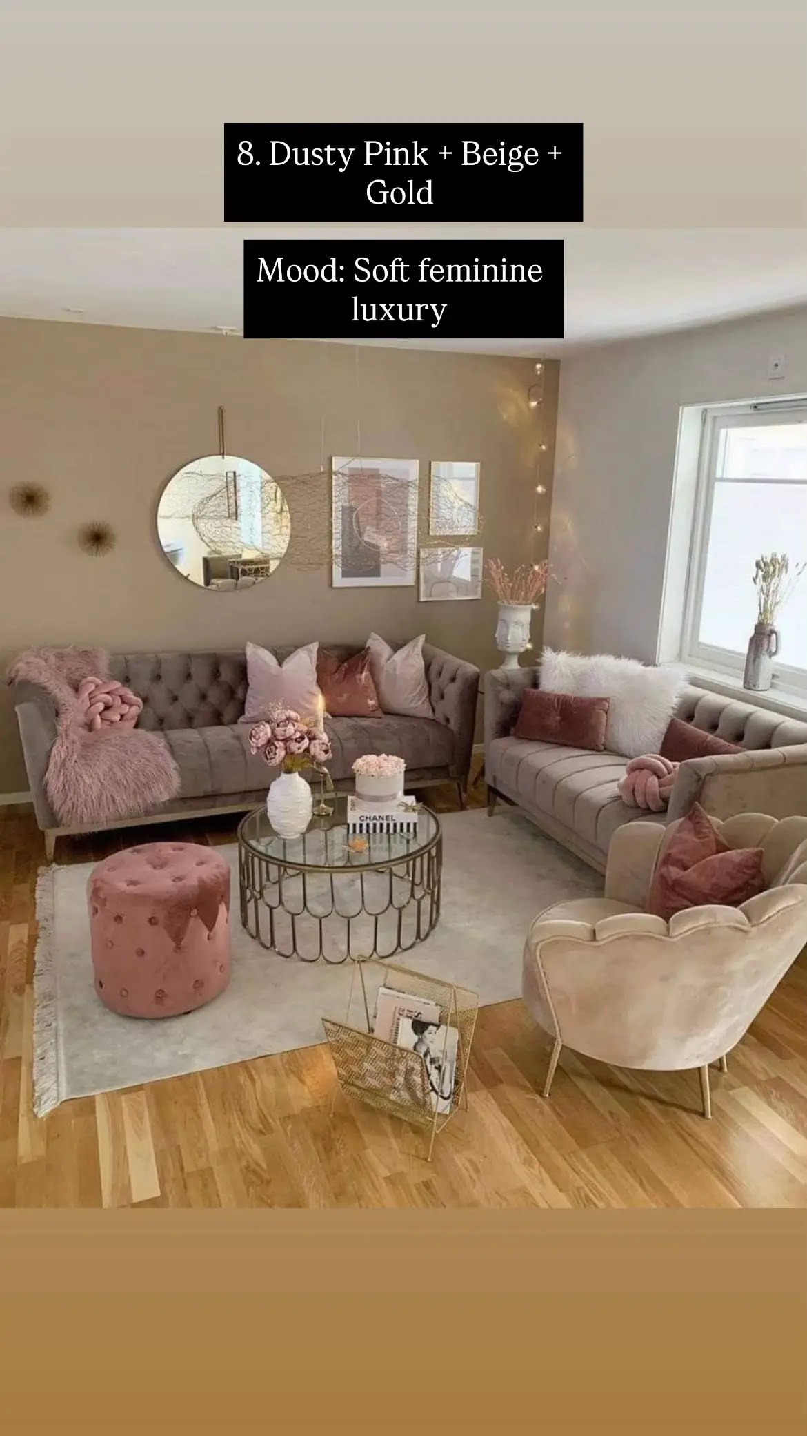
A grey sofa, white-and-oak TV stand, light wood coffee table and open shelving — Scandinavian minimalism suited to Nairobi apartments.
This palette works beautifully in Nairobi’s newer apartment buildings — especially those with light wood-effect flooring. Warm grey walls (not the cool, flat grey of ten years ago — think greige or warm stone) pair with a white ceiling and natural light oak wood furniture throughout.
When your colour palette is restrained, texture becomes your tool. The grey sofa has woven texture. The wood shelving is raw and open. The cushions are multi-tonal. This is how minimalism avoids feeling empty.
Best for: Studio apartments and smaller living rooms under 20 sqm. Light tones make spaces feel larger and airier.
Combination 04
Terracotta + Cream + Sand
Mood: Warm & cosy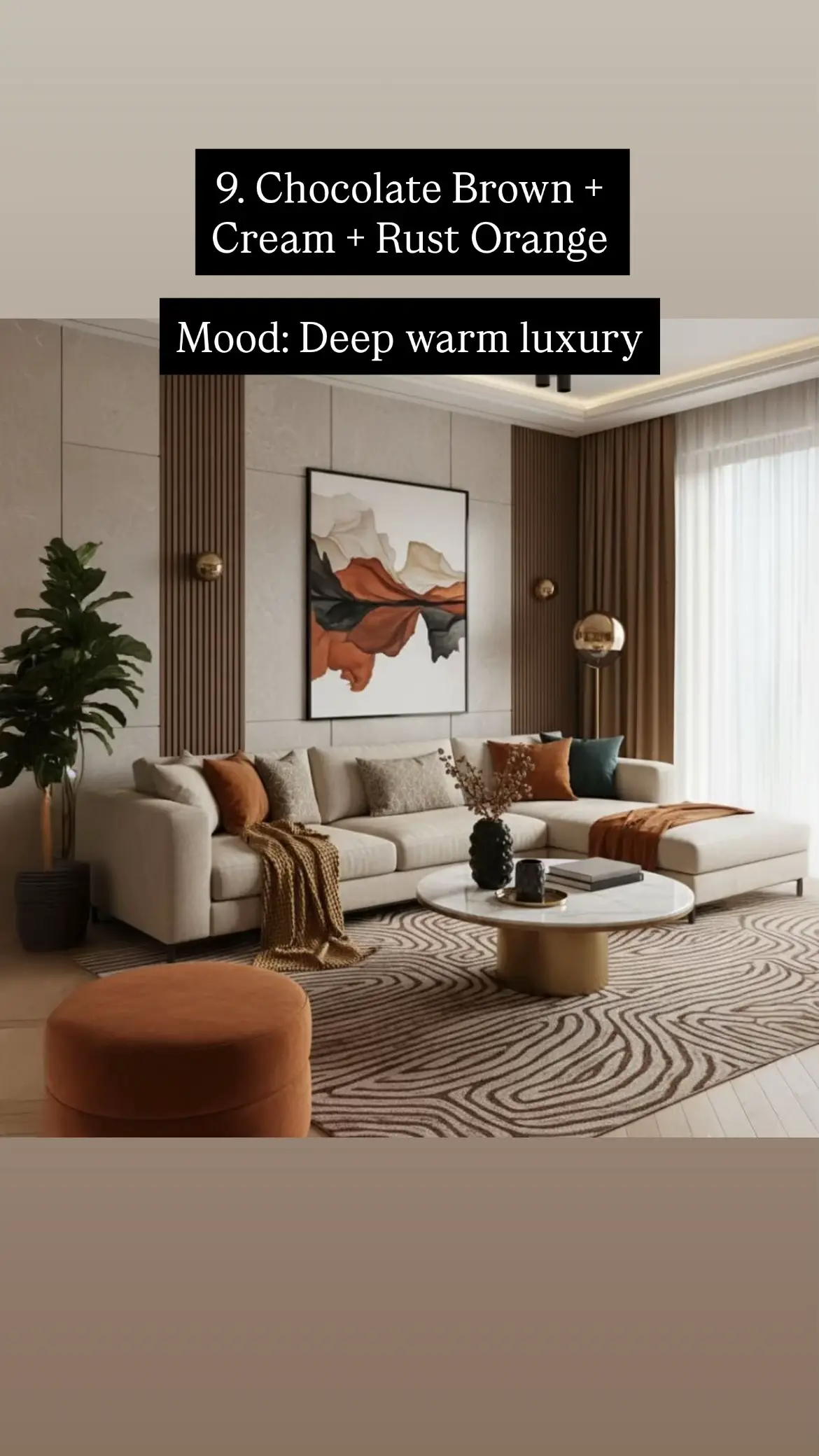
A terracotta feature wall, cream sofa and rug, gallery wall of botanical prints, and warm amber lighting — instant, genuine cosiness.
Terracotta is one of Kenya’s most natural colour choices. It echoes our earth, our landscape, our architectural tradition. And in 2026 it has come fully into its global moment — no longer merely “earthy,” now definitively sophisticated.
The key: use terracotta on one wall only. This stops it from feeling heavy and allows the cream sofa and rug to act as breathing space. The amber-toned pendant lighting in this image is doing critical work — it deepens and warms the terracotta rather than washing it out with cool white light.
Best for: Homes with good afternoon light — terracotta deepens beautifully in warm evening light. Great for family sitting rooms in Nairobi’s mid-density estates.
Combination 05
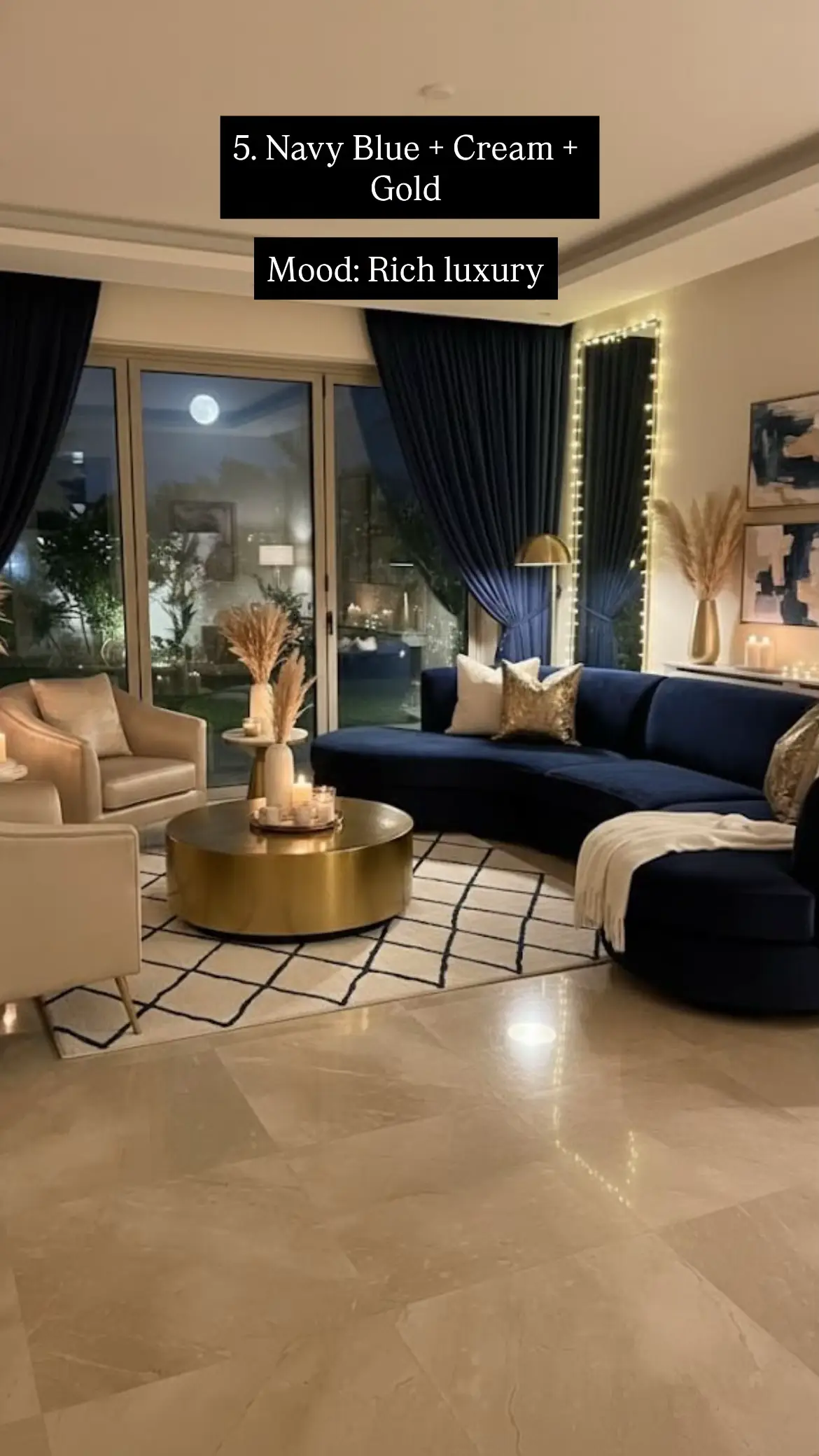
Navy Blue + Cream + Gold
Mood: Rich luxury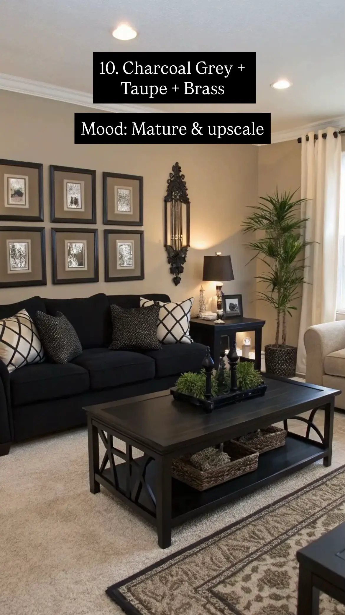
A navy curved sectional, gold drum coffee table, cream accent chairs, and navy drapes — the richest combination on this list.
If you want your living room to feel genuinely luxurious, this is your palette. Navy blue has replaced cool grey as the go-to “serious” colour in 2026 interiors globally — because it carries depth and grandeur that grey simply cannot match.
The formula is textbook: navy as the sofa and curtains (the dominant), cream in the accent chairs, cushions, and rug (the light relief), and gold in the coffee table and lamp bases (the warmth that stops the navy from feeling cold or corporate).
Best for: Large maisonettes, entertaining spaces, ground-floor villas with high ceilings and good artificial lighting.
Combination 06
Sage Green + Off White + Oak Wood
Mood: Calm & refreshing
Sage green panelled feature wall, off-white bouclé sofa, terracotta coffee table, and pampas grass — nature brought indoors beautifully.
Sage green is having its biggest moment in 2026, and this room shows it at its best. The dark sage panelled wall is rich and architectural without being aggressive. Against it, the off-white bouclé sofa and light oak wood floor provide the neutral relief that lets the green breathe.
The genius touch is the terracotta coffee table. It introduces warm colour that stops the sage-and-white from feeling too cool — a third element that makes this three-colour palette feel layered rather than flat.
Best for: Homes with indoor plants and natural light. One of the most photographable combinations — perfect if you want an aspirational-looking space.
Combination 07
Black + White + Grey
Mood: Bold modern luxury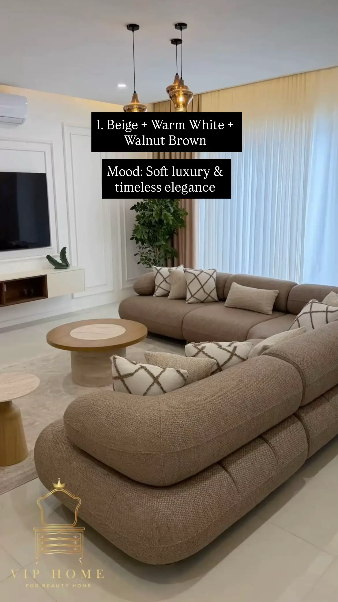
A fully monochromatic scheme — black TV wall unit with integrated LED lighting, dark grey sectional, and white floor — the ultimate modern luxury statement.
This is the most architecturally driven combination on the list. It is not for everyone — but for those who want a living room that feels like a five-star hotel lobby, nothing comes close.
The key to making it work is warm LED lighting. This room uses strip lights embedded in the ceiling coffers and TV wall unit — it is that warm amber glow that stops the monochrome palette from feeling cold or cave-like. Without good lighting design, this scheme becomes oppressive. With it, it becomes extraordinary.
Best for: Premium apartments in Upper Hill and Kilimani, entertainment rooms, design enthusiasts who want a signature space.
Combination 08
Dusty Pink + Beige + Gold
Mood: Soft feminine luxury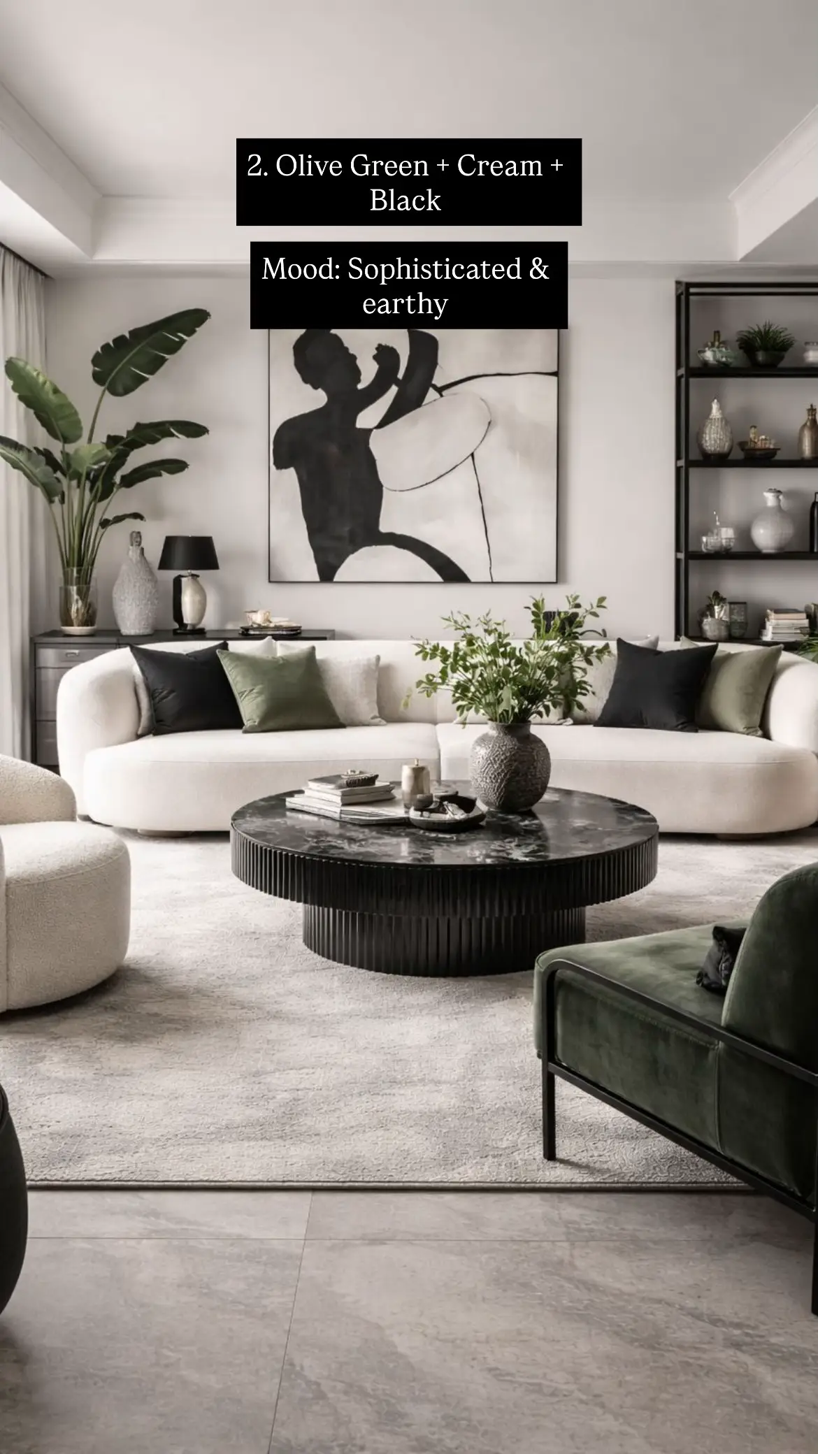
Taupe tufted sofas, dusty pink cushions and ottoman, gold-frame glass coffee table, and soft warm lighting — romantic and genuinely inviting.
Dusty pink is not the baby pink of a decade ago. In 2026 it is a muted, sophisticated rose tone that reads as feminine without being childish. Combined with warm beige walls and gold accents, it creates a living room that is romantic and welcoming in a way that few other palettes achieve.
This combination is at its best in evening light. The warm-toned lamps and soft lighting in this image are doing critical work — this palette needs warmth to feel luxurious. In harsh daylight it can look flat. The solution is layered warm lighting: floor lamps, table lamps, and soft ceiling light rather than a single overhead fixture.
Best for: Bedrooms with adjoining sitting areas, single-occupant apartments, homeowners who want a space that feels like a personal sanctuary.
Combination 09
Chocolate Brown + Cream + Rust Orange
Mood: Deep warm luxury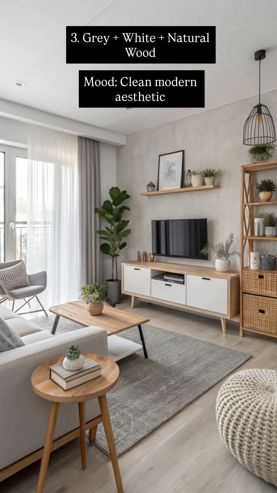
Cream L-shaped sofa, chocolate brown slatted wall panels, rust orange ottoman and cushions, and a marble-and-gold coffee table — layered warm luxury.
This is the palette for Kenyan homes that want depth and drama without going dark. Chocolate brown — used here in the architectural slatted wall panels and curtains — creates a warm backdrop that makes the cream sofa glow. Rust orange introduces the energy through the pouffe, cushions, and throws.
What this room does brilliantly is use the wall as furniture. The vertical slatted chocolate brown panels are structural and decorative at once — they frame the artwork and give the room the sense of a professionally designed space without any other wall treatment needed.
Best for: Open-plan homes with high ceilings, dining-living combined spaces, homes where you want terracotta’s warmth with more sophistication.
Combination 10
Charcoal Grey + Taupe + Brass
Mood: Mature & upscale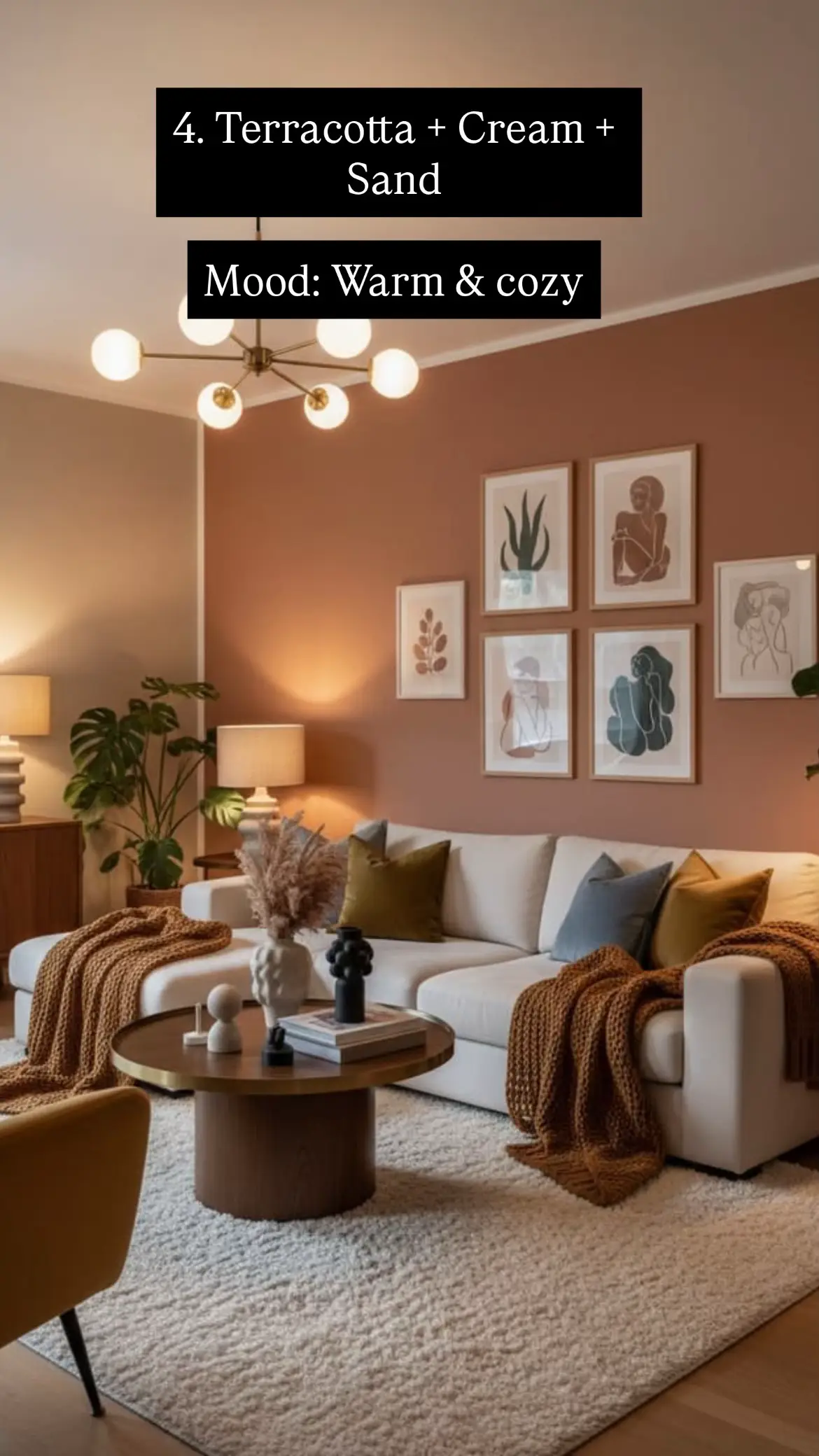
Dark charcoal sofa, ebony coffee table, taupe walls, cream curtains, and an ornate brass mirror — understated and genuinely upscale.
The most grown-up combination on this list. Charcoal — as both the sofa and coffee table — against taupe walls (a warm, greige tone) creates a room with real gravitas. Cream curtains and a tall indoor palm bring the light back in, while the ornate brass mirror and framed gallery wall add the personality that stops the palette from feeling corporate.
This is the combination interior designers reach for when a client says “I want something that looks expensive but is easy to live with.”
Best for: Mature homeowners who want a room that feels collected and thoughtful rather than trend-driven. Works well with dark wood floors or dark tile accents.
Which Combination Is Right for You?
By light level
- Limited light → 1, 3, or 6 (warm, reflective tones)
- Good natural light → any combination, including 5, 7, 9, 10
By room size
- Under 20 sqm → 1, 3, 6, 8 (lighter palettes)
- Open-plan / large → 5, 7, 9, 10 (darker, bolder)
By mood
- Calm & peaceful → 3, 6
- Warm & cosy → 4, 9
- Bold & dramatic → 5, 7
- Romantic → 8
By lifestyle
- Family with children → 1, 3, 4, 9
- Entertainer → 5, 7, 10
- Plant lover → 2, 6
- Minimalist → 3, 7
| # | Palette | Sofa colour | Wall colour | Accent | Mood |
|---|---|---|---|---|---|
| 1 |
Beige + Warm White + Walnut | Beige / camel | Warm white | Walnut wood | Timeless |
| 2 |
Olive Green + Cream + Black | Cream / white | Off white | Olive + black | Sophisticated |
| 3 |
Grey + White + Natural Wood | Light grey | Warm grey | Natural oak | Modern |
| 4 |
Terracotta + Cream + Sand | Cream | Terracotta (feature) | Sand + warm wood | Warm & cosy |
| 5 |
Navy Blue + Cream + Gold | Navy | Cream / warm white | Gold / brass | Rich luxury |
| 6 |
Sage Green + Off White + Oak | Off white | Sage green (feature) | Terracotta + oak | Calm |
| 7 |
Black + White + Grey | Charcoal | White | Black + warm LED | Bold luxury |
| 8 |
Dusty Pink + Beige + Gold | Taupe / grey velvet | Warm beige | Dusty pink + gold | Feminine luxury |
| 9 |
Chocolate + Cream + Rust | Cream / off white | Cream + brown panels | Rust orange | Warm depth |
| 10 |
Charcoal + Taupe + Brass | Charcoal | Taupe | Brass + cream | Upscale |
Choose Your Sofa Colour First
The most common mistake Kenyan homeowners make is choosing wall colour first and furniture second. Your sofa is the largest single colour element in any living room — it costs the most and changes the least. Let it drive the palette, and everything else falls naturally into place.
At Monsoon Furniture in Ngara, Nairobi, our sofa sets come in neutral, versatile finishes that anchor any of the 10 palettes above. Once you know which combination you want, the sofa choice becomes simple.
Frequently Asked Questions
What is the most popular living room colour combination in Kenya in 2026?
Beige + warm white + natural wood remains the most popular choice because it suits both apartments and maisonettes, works with most tile colours, and is genuinely timeless. Sage green + off white is growing rapidly as the trendiest option in 2026.
What colour sofa goes with any wall colour?
A cream, beige, or warm greige sofa is the most versatile choice. It works with all 10 combinations above and can be refreshed each season through different cushion colours — which are far cheaper to change than a sofa.
Can I use dark colours like navy or charcoal in a small Nairobi apartment?
Yes — with two rules: use the dark colour on one feature wall or one large furniture piece only (not all four walls), and ensure you have good artificial lighting in warm tones. A navy sofa against warm white walls in a small room looks deliberately designed, not cramped.
What colours make a living room look more expensive?
Three moves cost very little but look expensive: (1) create contrast between your sofa and wall rather than matching them in similar tones, (2) add a large rug under both the sofa and coffee table to define the seating zone, and (3) replace cheap plastic décor with a few quality ceramic or wooden pieces. Contrast, a defined zone, and quality accents elevate any room.
Which living room colours are going out of style in 2026?
Cool icy greys and brilliant white-on-white schemes feel dated in 2026 — they lack the warmth and depth that homeowners now want. Also avoid pairing chrome or silver hardware with navy or charcoal sofas; it pushes rooms toward a cold, clinical feel. The 2026 direction is earthy, warm, and organic.
Add a review
Your email address will not be published. Required fields are marked *